Luna AzizLuna Aziz

Senior Product Designer

Focusing on creating meaningful user experiences and solving problems through human-centered designs.

Recent Projects

Mavis Digital Website - slide 1

Mavis Digital Website

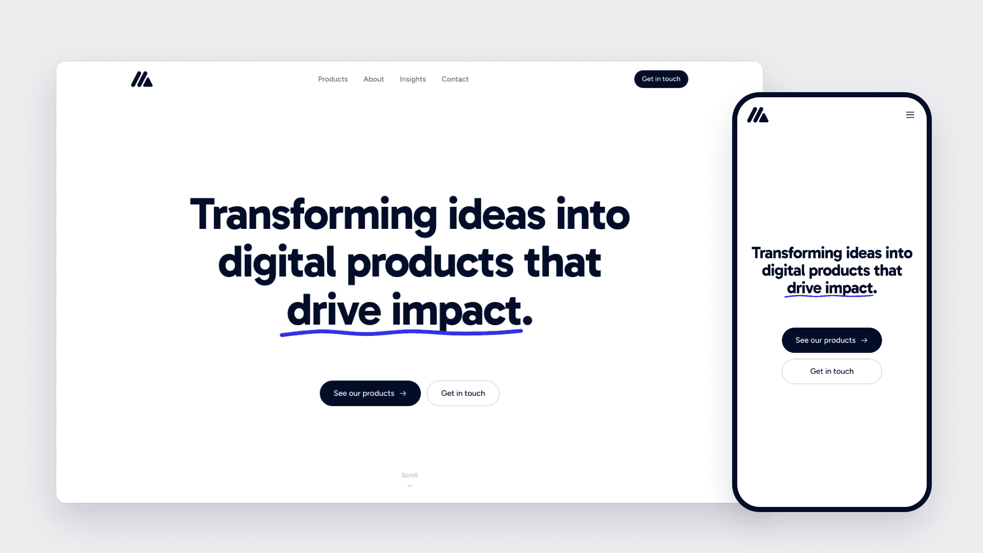
Mavis Digital is the Malaysian company behind Foodpoint and VidFlo. I designed its corporate website and directed the build within 2 weeks, from an empty Next.js project to the live site at mavis.com.my. I owned the brand system, the hero concept and the design decisions on every page, and built it with Claude Code as my engineering partner. A brand in three colours The brand is ink (030D28), white and a pale mist (F9F9FB). I interpolated the grey scale between ink and mist, so every grey on the site carries a slight navy cast. One blue (2F2FE4) sits outside the brand. It started as the collaborator colour in the hero and now marks the label above each section, so the same blue runs from the top of the page to the contact form. Type follows the same discipline. Gabarito sets headings, Figtree sets body copy, and Gloria Hallelujah only appears as handwriting in the hero. Components use a semantic type scale defined in one stylesheet, so changing a size is one line in one place. A hero that shows the work Mavis turns ideas into products, and the hero acts that out. The headline is written by hand onto ruled lines. A collaborator's cursor picks Gabarito from a font menu and drags the size from 64 to 92, then switches to a pen and underlines "drive impact". Pacing took the most iteration. There's a short hold after the writing and another after the typeface is picked, because those are separate decisions. The resize and the underline run together, since the pen is already in hand. Motion that never hides content If the animation fails, the visitor still sees the page. Hidden starting states only apply once a script confirms animation can run, so reduced motion, no JavaScript or a failed download all fall back to the full page. The headline is also the page's Largest Contentful Paint element. Animated with GSAP, LCP measured 2.6 seconds on throttled mobile, so I moved the handwriting into CSS, which starts on first paint. Replacing a perletter fade with a clip reveal then took LCP from 1.3 to 1.8 seconds down to 40 to 130 milliseconds, with layout shift below 0.01. Content that gives the site something to say At launch, four pages held around 500 words. I added About, a page for each product and an Insights section, bringing the site to roughly 4,500 words, along with structured data, a share image and analytics that stay off until a visitor agrees. Designing with an AI build partner I owned direction and judgement. Claude Code wrote the implementation and recorded the reasoning in code comments and commits, which is why I can quote exact numbers here. The more precise my request, the better the result: asking to measure the headline as the LCP element on throttled mobile is what led to the CSS rebuild.

View Project
Foodpoint Design System - slide 1

Foodpoint Design System

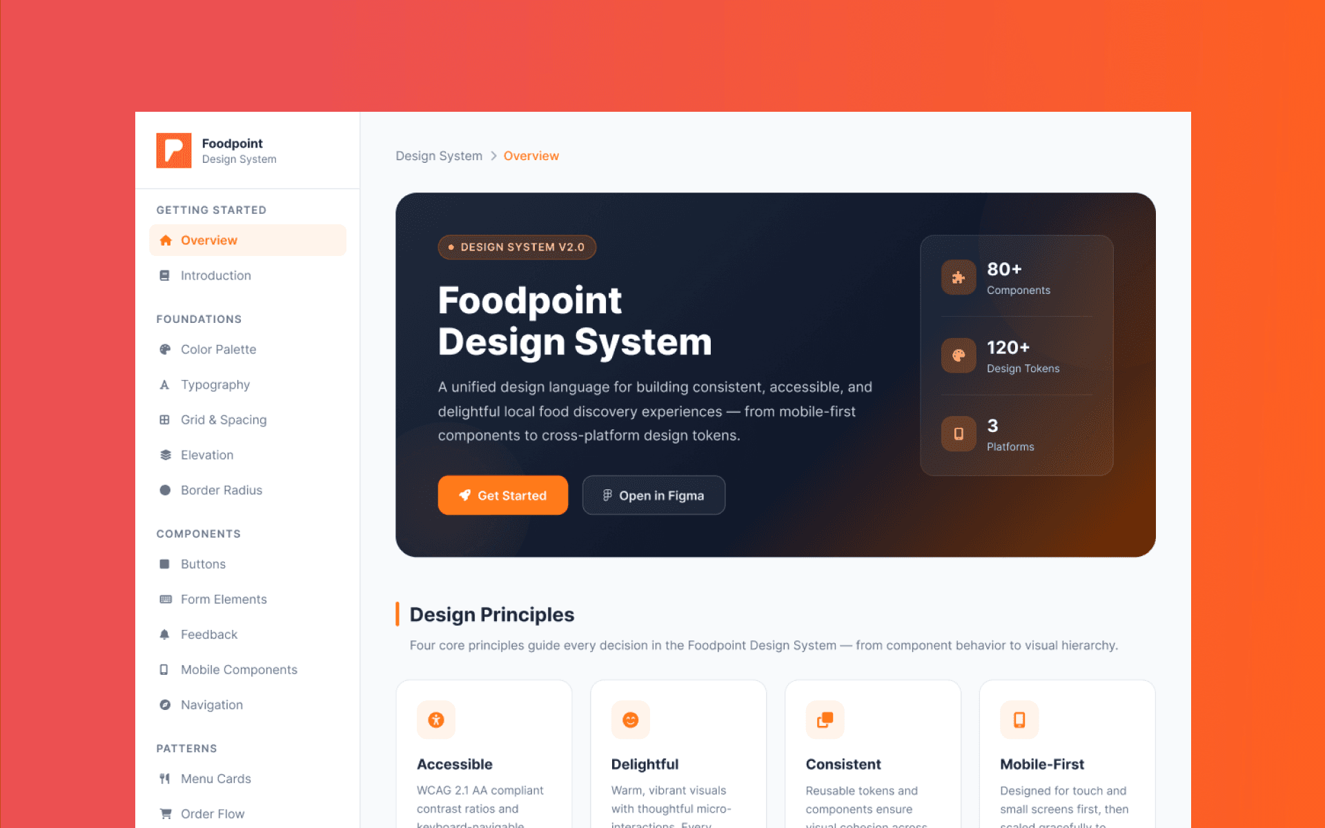
When I first began building the design system for Foodpoint, my single goal was to unify the user experience across iOS, Android, and Web. A brand design system is a documented set of rules and reusable assets that govern how the brand looks and communicates across every surface. A real design system includes: Design tokens — The atomic values that define visual language: hex codes, font sizes, spacing units, border radius Color palette — Primary, secondary, neutral, and semantic color roles with usage rules Typography scale — Font families, weights, sizes, and lineheight rules for every text style Logo guidelines — Clear/safe zones, approved color variants, prohibited uses Component library — Buttons, cards, form fields, navigation patterns; each with defined states and variants Usage documentation — Written rules that explain when and how to use each element Step 1: Establish Brand Foundation Designing a logo is the first step in building your brand and a mark of professionalism in business. What is logo design? Logo design is the process of creating a unique visual symbol or mark that represents a brand’s identity, values and recognition in the marketplace. For Foodpoint, I'm taking consideration of 2 types of logo for the brand to serve the purposes for use for both web and mobile applications. 1. Wordmark: Logo built from full brand name 2. Pictorial Mark: Icon or symbol represents brand Step 2: Build Your Color System The next main question most designers asked: “How do you define and choose the right colours of a brand?” Understanding brand values helps me to create a colour language for this brand. I find colour inspiration from websites, photography and posters to get the right colour palette. Foodpoint represent emotions of fun and cheerful energy, so the color Tangerine Orange has been selected as the key color for the brand. After choosing the colours, it’s time to create a colour language which is part of the design language of the brand or the style guide. Having only brand color is not enough, I also need to define the Primary colours, Secondary/Accent colours, Typography colours, background colours. When I have the complete color palette, I implement 603010 rule to harmonize the color scheme and make a wellbalanced interface design. When choosing a new color palette, 60% of the palette is dedicated to the dominant color — usually, we call it neutral. Secondary color, or complementary, makes up 30% of the palette, and a third color, accent one, is used for the remaining 10% of the design. Design Tokens is for consistent theming across atoms and organisms. I'm using Figma for mapping design layers to component hierarchy. Step 3: Define Your Typography Scale Before choosing font stack, there is 3 main questions to ask: Do you have licensed fonts already, or do you need free/opensource options? Are you building for web, mobile, print, or all three? Do you want one typeface family or two (e.g., a serif for headings, sansserif for body)? Step 4: Design Component Library A component is any reusable UI element: buttons, cards, form inputs, navigation bars, alerts, badges. Building UI components using Atomic Design Methodology Atomic Design is formulated by Brad Frost, in which everything begins with the smallest element of the interface: the atom. Atomic Design provides a shared language and structure that solves several key problems: Consistency Every component has a defined place and purpose. Reusability Common patterns are built once and reused everywhere. Scalability Teams can confidently expand without breaking existing UI. Crossdiscipline alignment Designers and developers speak the same ‘atomic’ vocabulary. | Level | Description | Example | | | | | | Atoms | The smallest building blocks of UI | Button, Input, Label | | Molecules | Groups of atoms that work together | Search Bar (Input + Button) | | Organisms | Complex components composed of molecules | Header, Card Grid, Product Tile | | Templates | Pagelevel layouts defining structure | Dashboard Layout | | Pages | Real, datafilled screens seen by users | Dashboard with actual user data |

View Project
Foodpoint Mobile App - slide 1

Foodpoint Mobile App

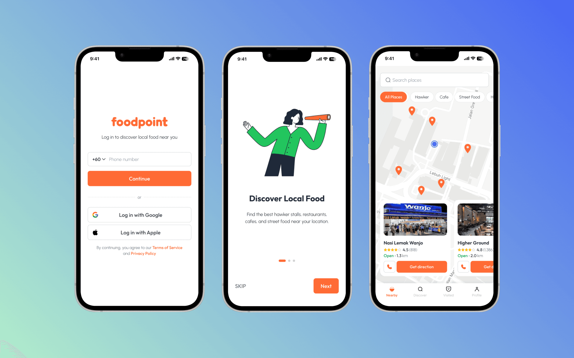
Foodpoint is a mobile app designed to help users discover authentic local food nearby, while supporting small, independent food businesses. Unlike general platforms like Google Maps, Foodpoint focuses exclusively on localowned eateries, creating a more curated and communitydriven experience. Problem Users often spend too much time searching, with low confidence in discovering truly local spots. Finding genuine local food is fragmented and inefficient: Existing platforms prioritize chains and sponsored listings Lack of dedicated discovery for local eateries Minimal connection between food lovers and local vendors Solution Foodpoint delivers a hyperfocused local food discovery experience: Curated listings of localowned food places only Builtin community engagement Growth support for small food business owners Target Users Food explorers looking for authentic local experiences Tourists seeking hidden gems Local communities supporting neighborhood businesses Core User Flows The product is designed around a frictionless, realworld journey: This flow prioritizes speed, simplicity, and action, minimizing cognitive load during decisionmaking. Design Process 1. Research & Ideation Identified gaps in existing tools (overcrowded listings, lack of local focus) Defined product vision: localfirst discovery platform 2. UX Strategy Designed a goaldriven flow centered on realworld behavior Reduced steps between discovery and physical visit 3. Wireframing Structured intuitive navigation for nearby browsing, merchant detail views and quick action (Directions, Checkin) 4. HighFidelity Design Clean, modern UI optimized for mobile usability Visual emphasis on food imagery and proximity Clear CTA hierarchy (especially “Directions”) 5. Development Built for both iOS and Android Leveraged Claude Code, an AIassisted tool to accelerate development cycles Impact Faster decisionmaking for users Increased foot traffic for local businesses Stronger communitydriven discovery ecosystem

View Project
Keyword Tool Main Website - slide 1

Keyword Tool Main Website

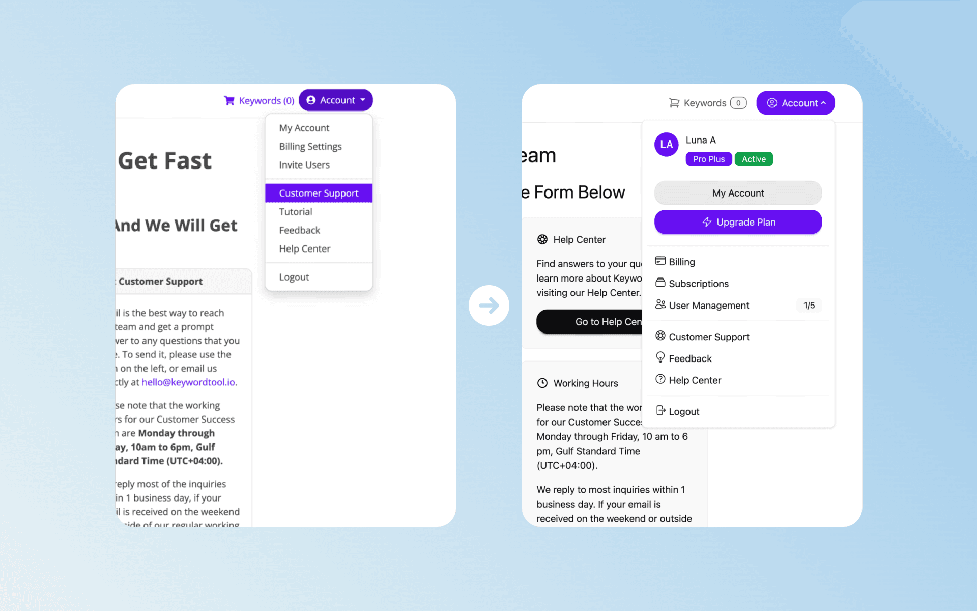
Keyword Tool is a dataheavy SaaS platform used by marketers to research and manage keywords. The existing experience suffered from high onboarding friction, unclear navigation, and weak mobile usability, impacting task efficiency and conversion. The Challenge The existing product suffered from inconsistent visual hierarchy, friction during signup, and limited mobile support for critical interactions — causing poor conversion and support load. The Problem User needs to manually enter their email and password for registration or login into their account. It can frustrates the user for thinking what password to use, even more when it didn't passed the password strength and requirements check. User profile menu lack of key information regarding about their account. Pricing plans missing an important CTA where users can click to contact sales team if they wanted to customize the plan. Customers have to enter manually, one by one, name and email address before sending an invitation. Customers are having some issues viewing some data or performing some tasks on mobile devices (for example, hover behaviour is not working on mobile). Result Reduced registration friction by implementing a quick login using their existing Google account, a complete process can be done in less than a minute. Added a quick glance of key information such as their account status, plan name and team quota under user profile menu. Added a new section below available plans for users to contact for plan customization. Reorganized information on account groups and introduced bulkinvite users. Introduced “Manage addons” feature for their current subscription plan. Improved the layout and visual data on both desktop and mobile devices, especially for the search result page. Improved the user interface (UI) for a simpler and modern look. Outcome The redesign delivers a clearer, faster, and more scalable user experience by aligning interface decisions with user goals and business needs. Key flows now prioritize clarity, efficiency, and accessibility, resulting in a more intuitive product across devices.

View Project
Keyword Tool CMS - slide 1

Keyword Tool CMS

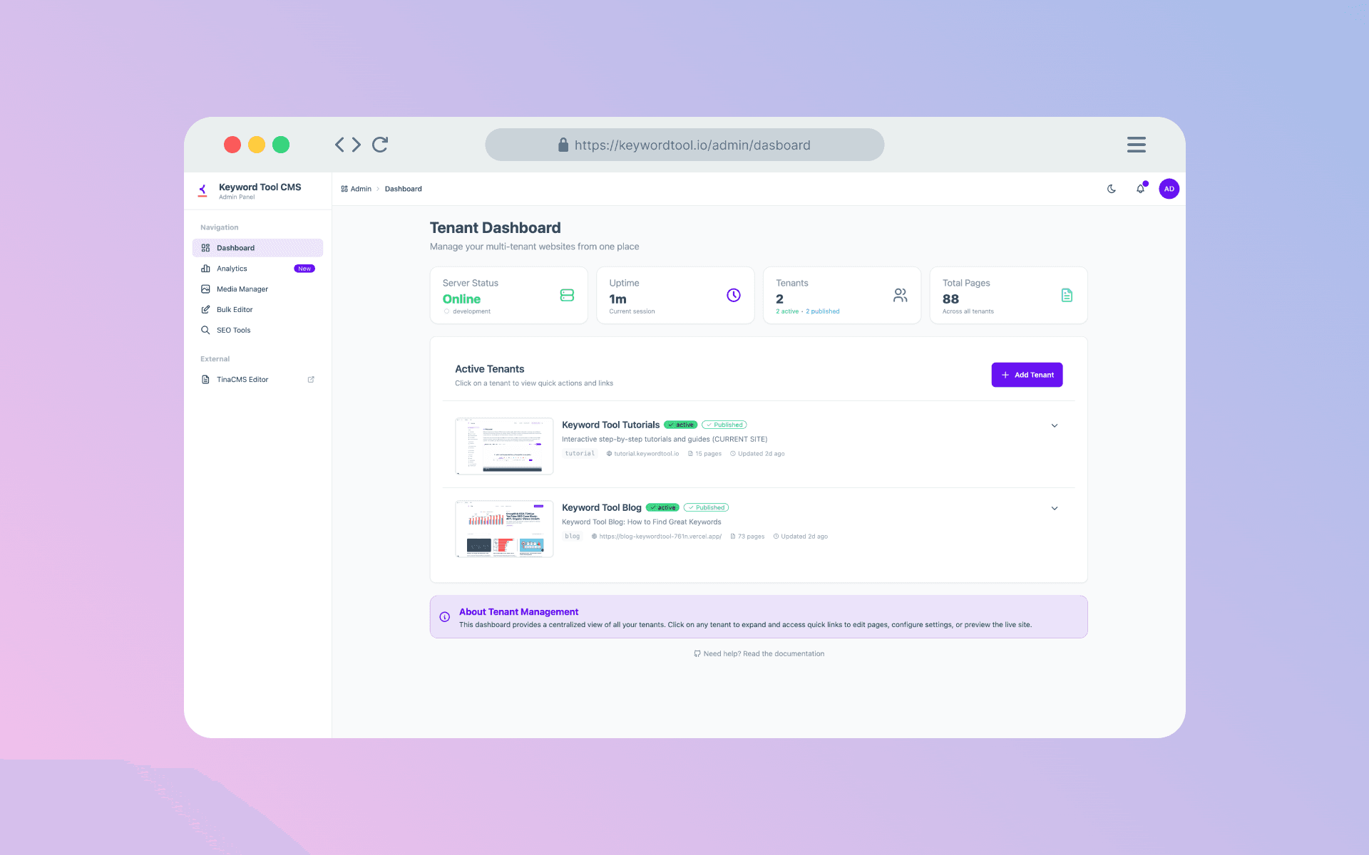
I built Keyword Tool Content Management System (CMS) platform that is integrated with TinaCMS in order to manage website content for both the blog and tutorial websites of Keyword Tool. I built it with TinaCMS multitenant approach in order to manage 2 websites at the same time by just using one unified CMS platform. The Solution Implemented TinaCMS multitenancy approach for better content organization. Implemented contextualediting which allows Admin to see live preview while editing content. Created theme system to ensure visual branding consistency.

View Project